Brand Identity Design
Shapers House
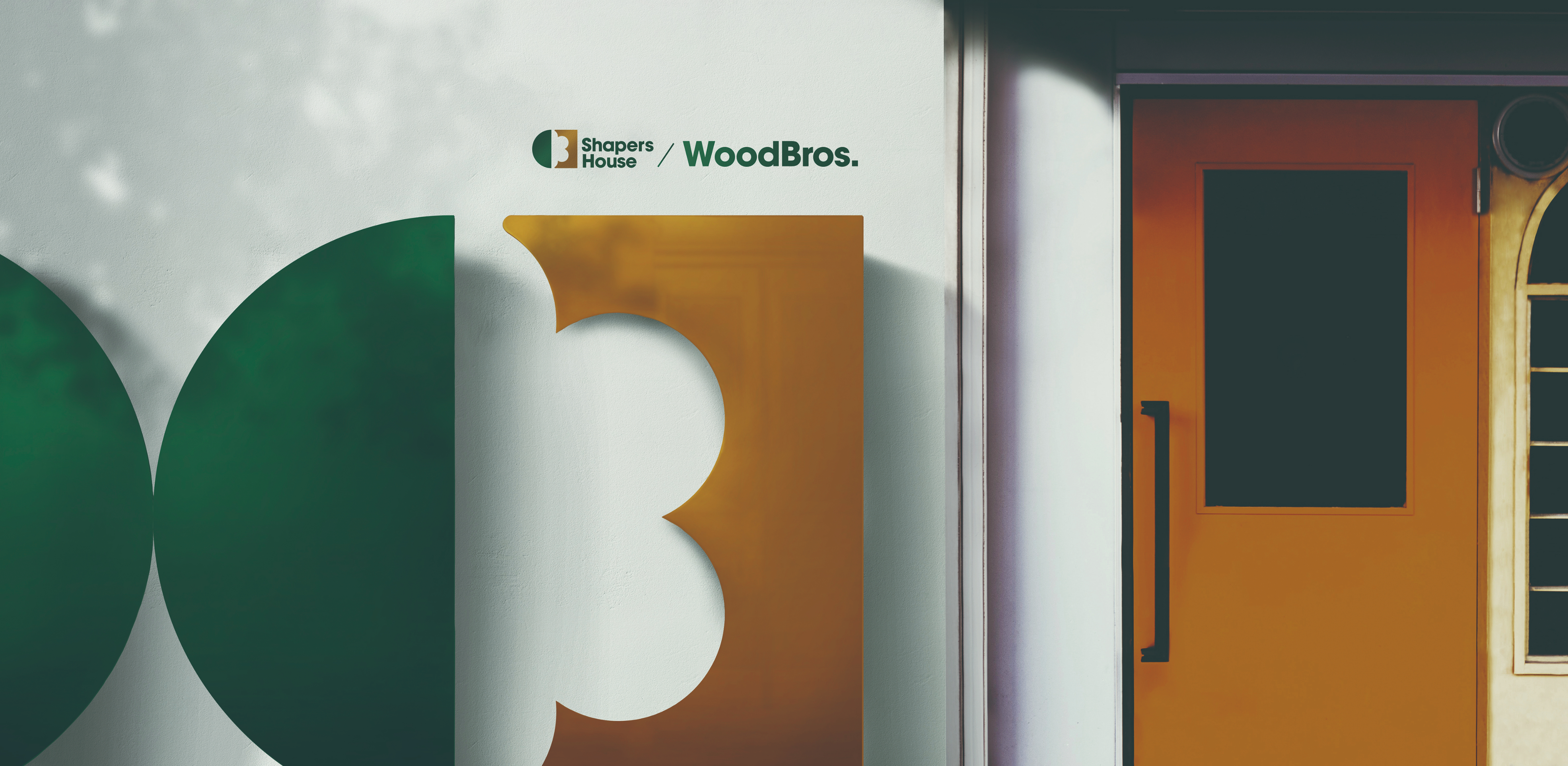
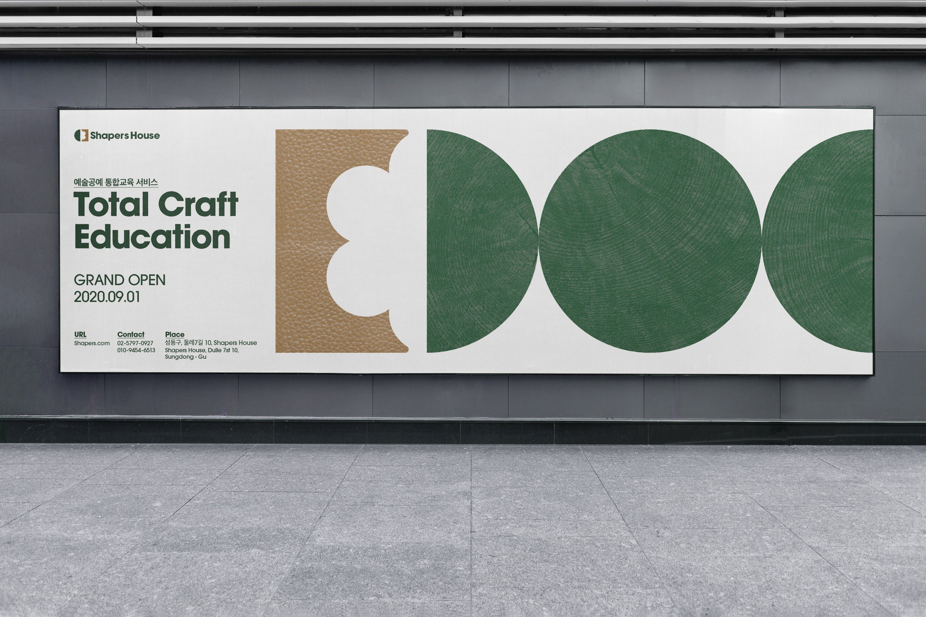
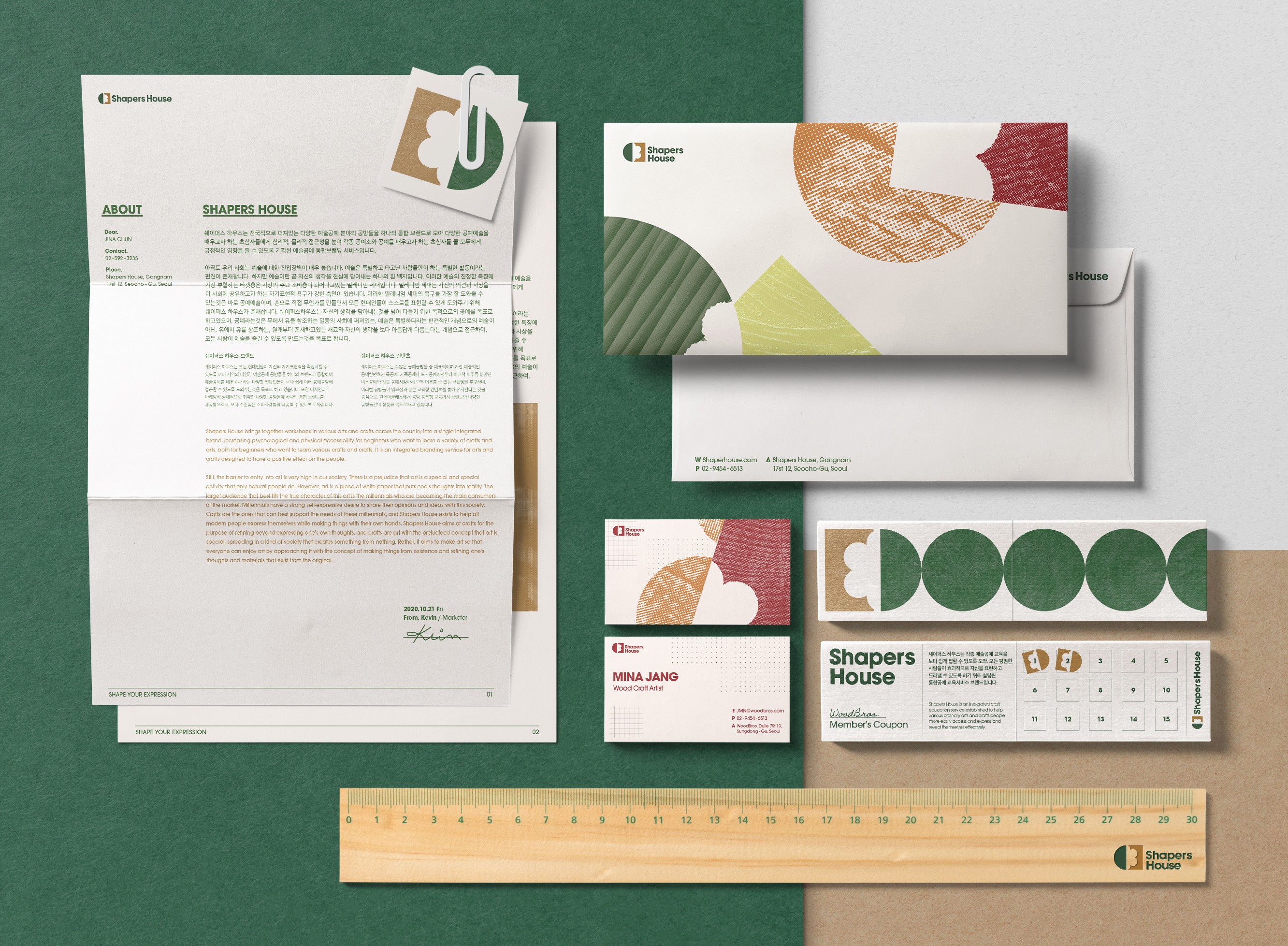
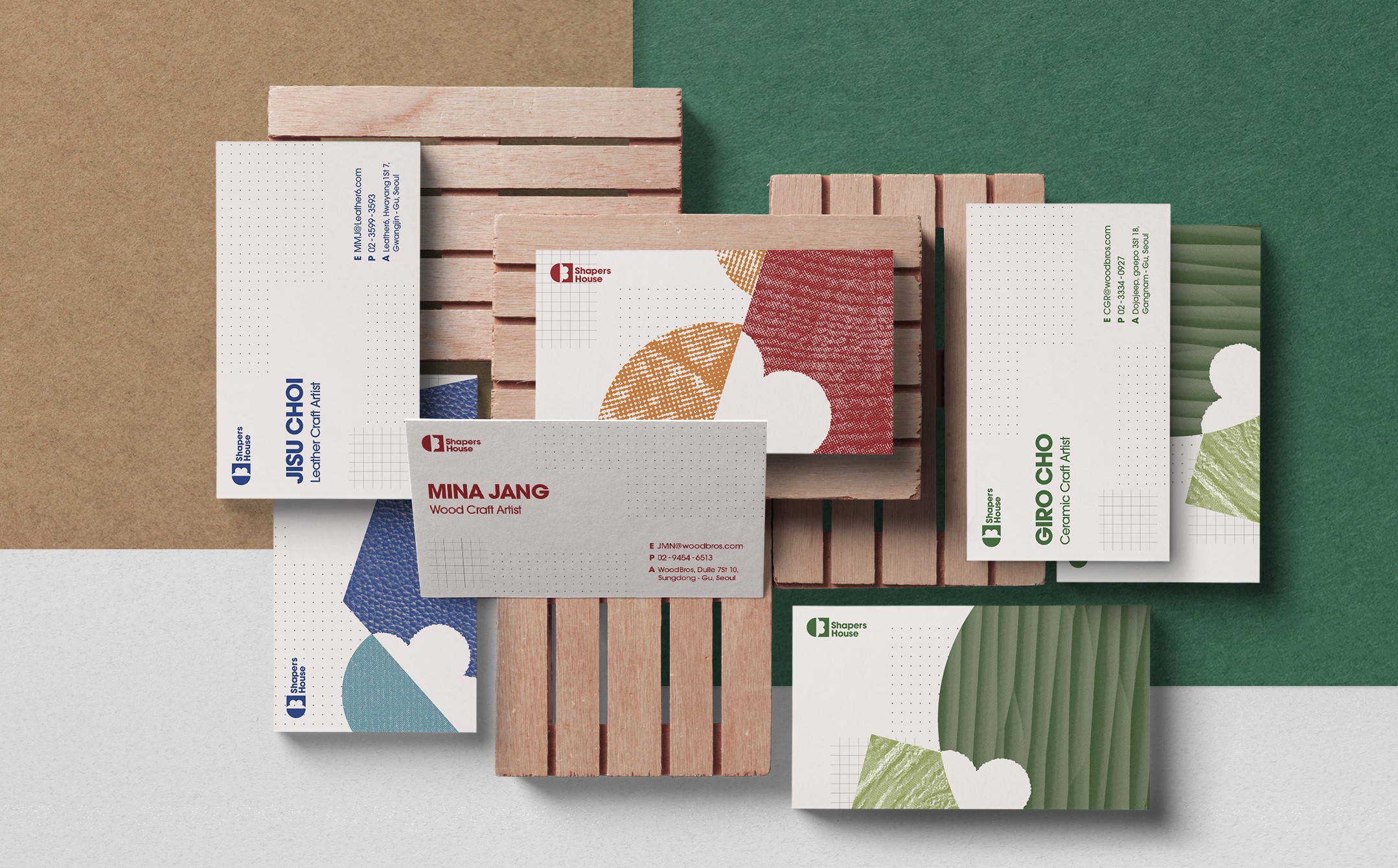
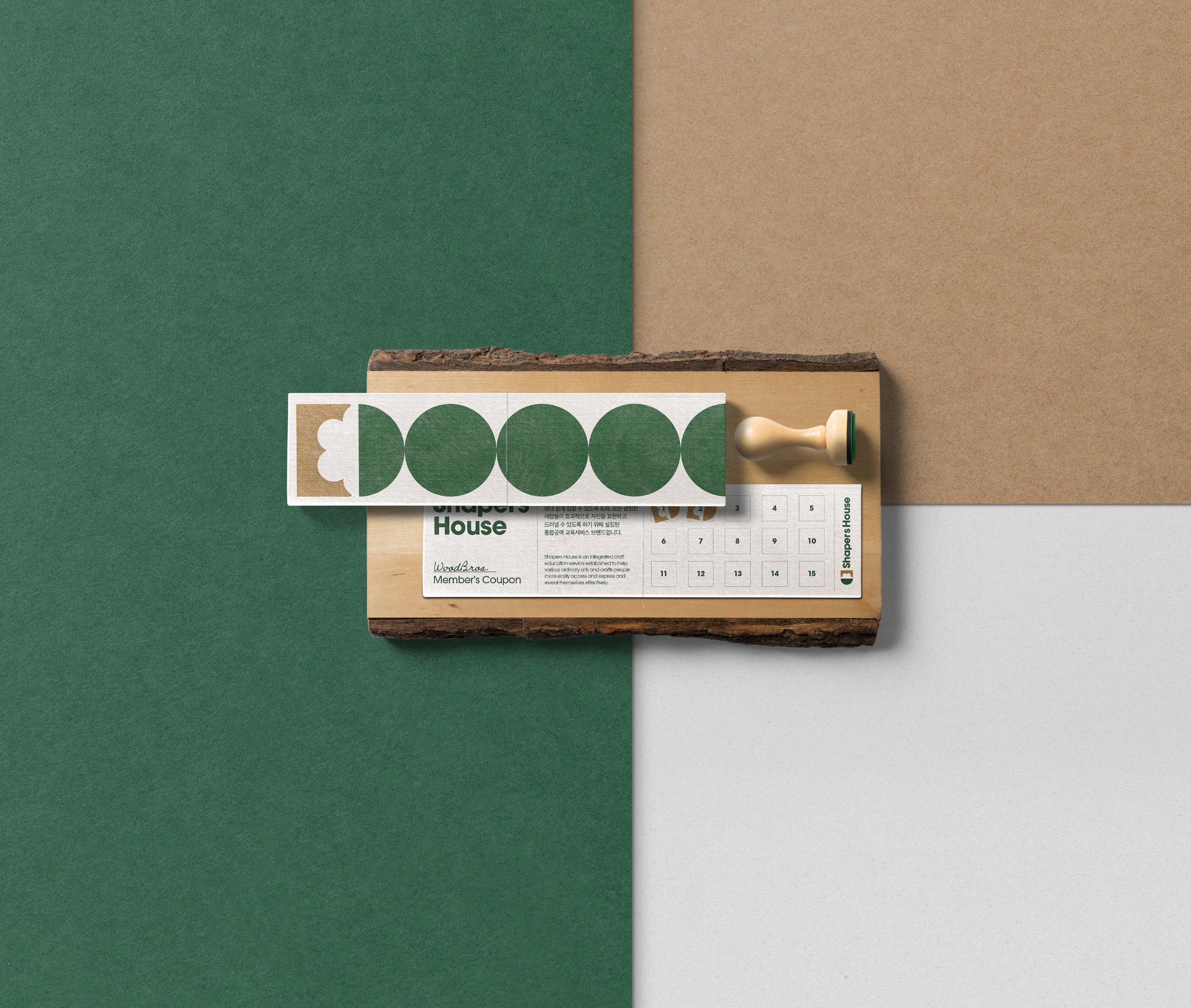
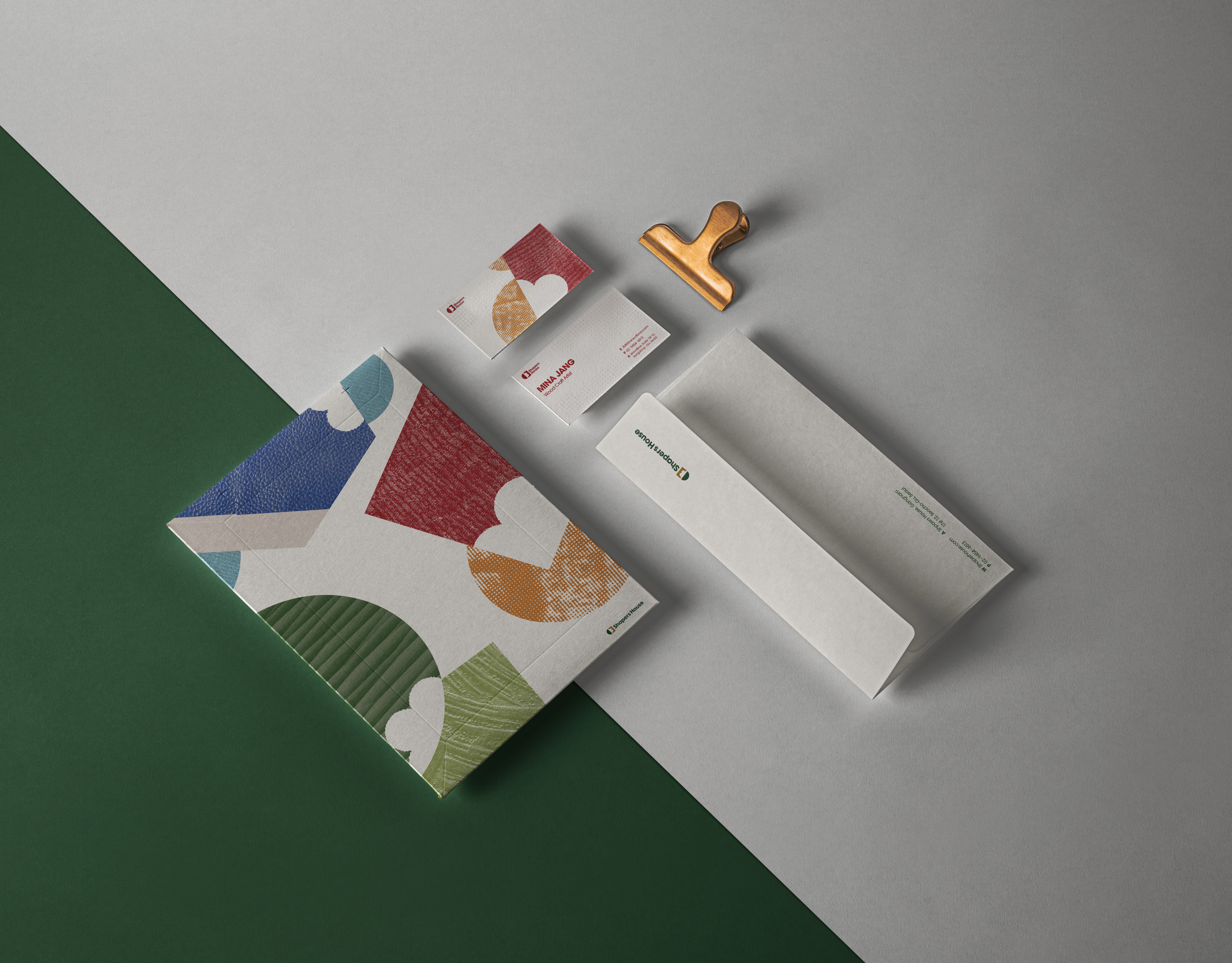
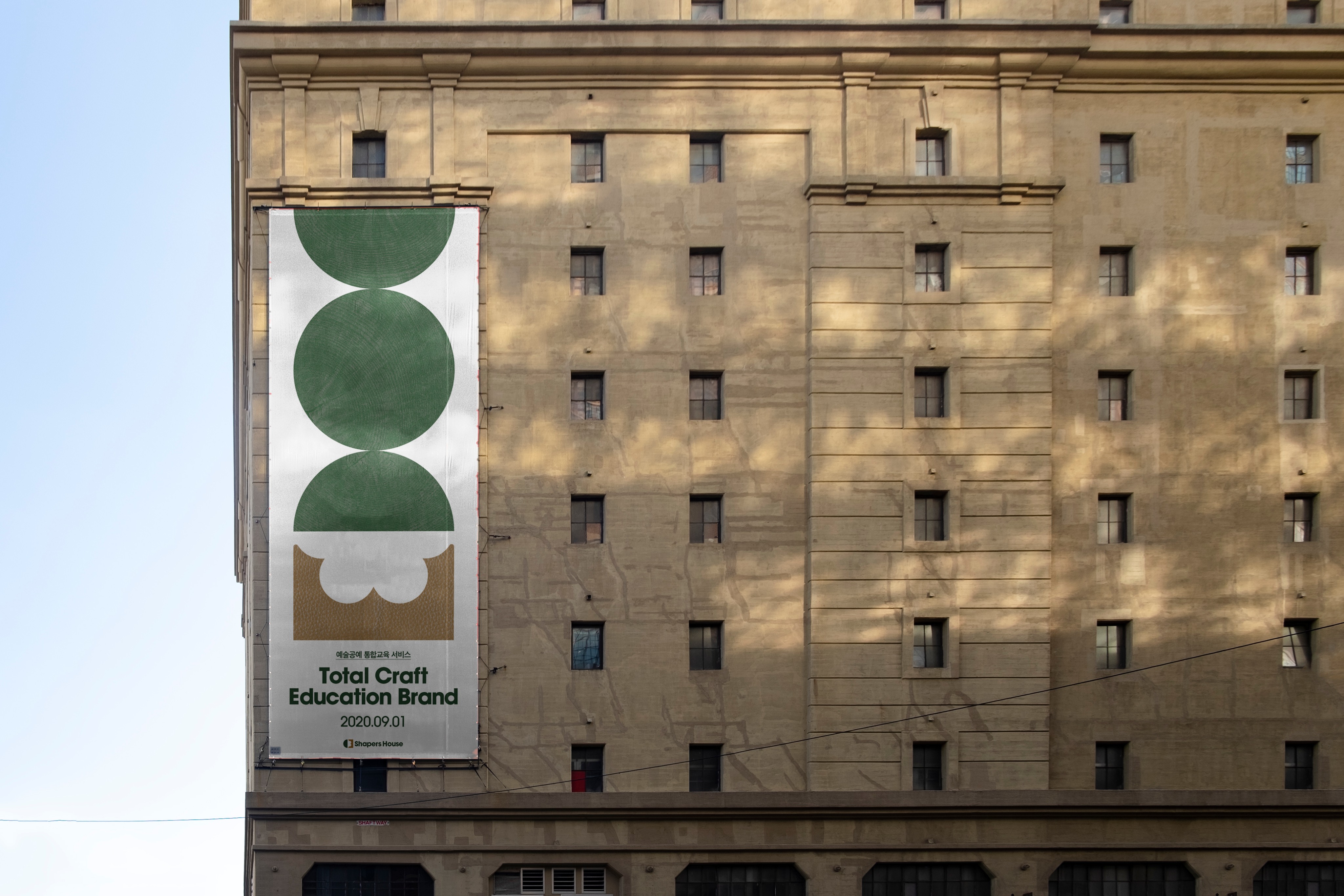
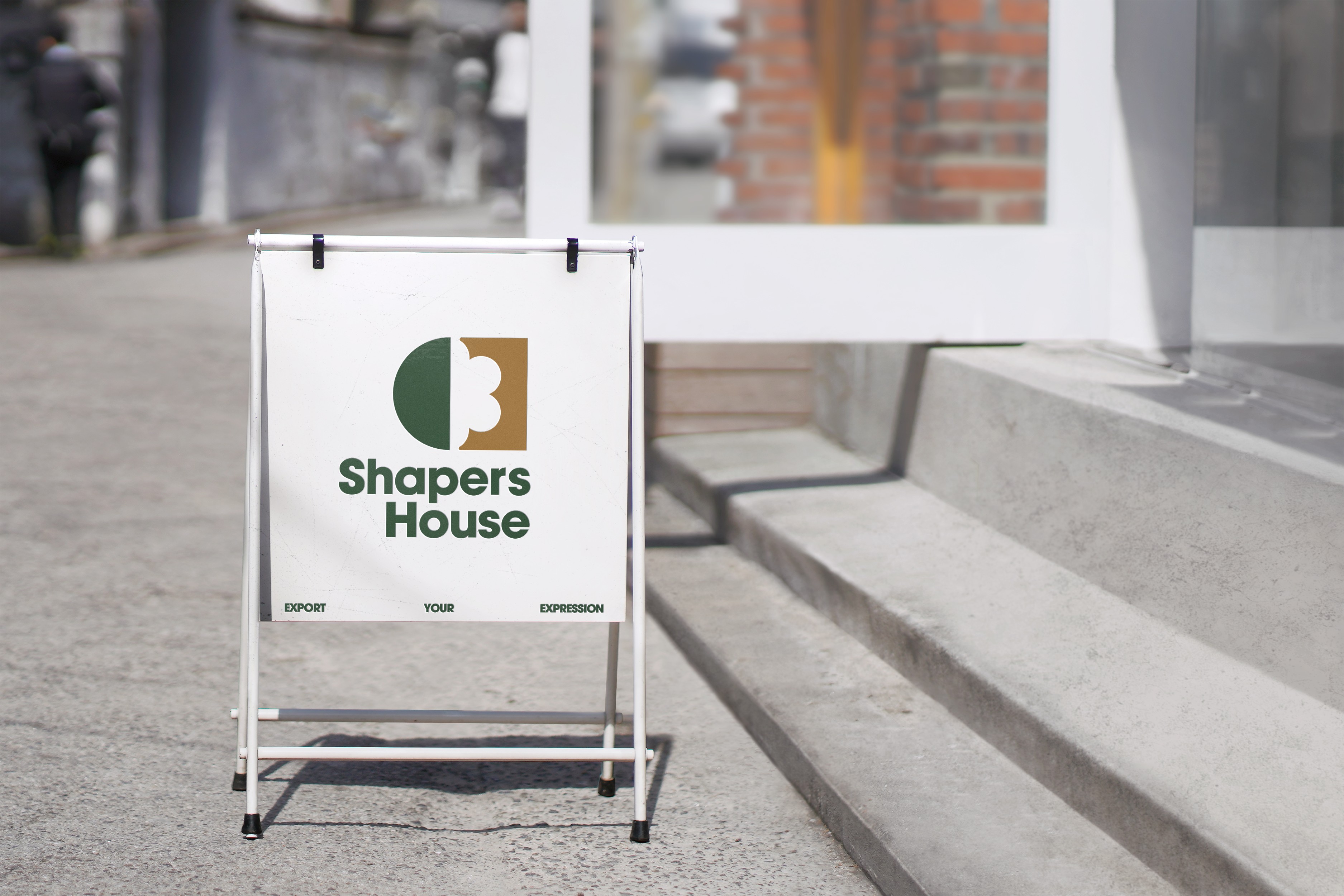
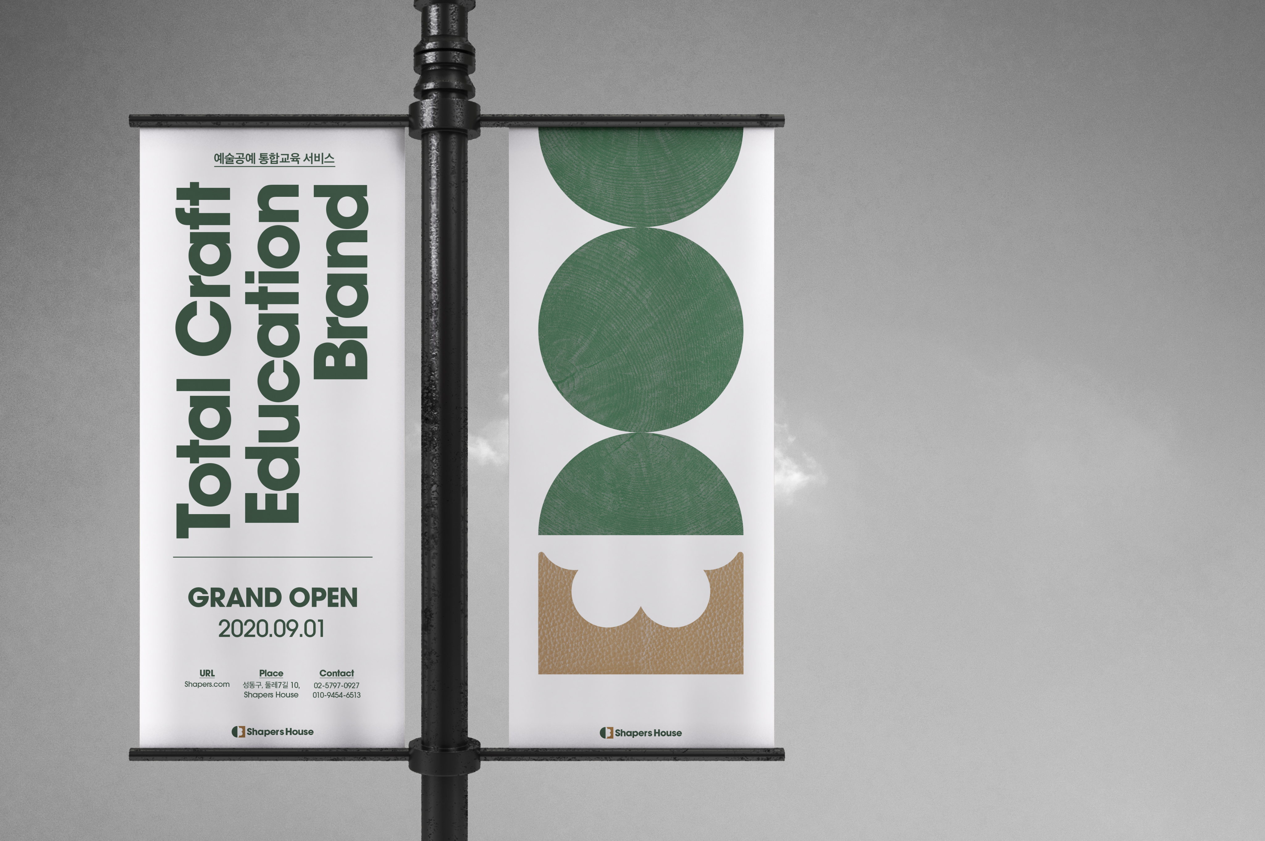
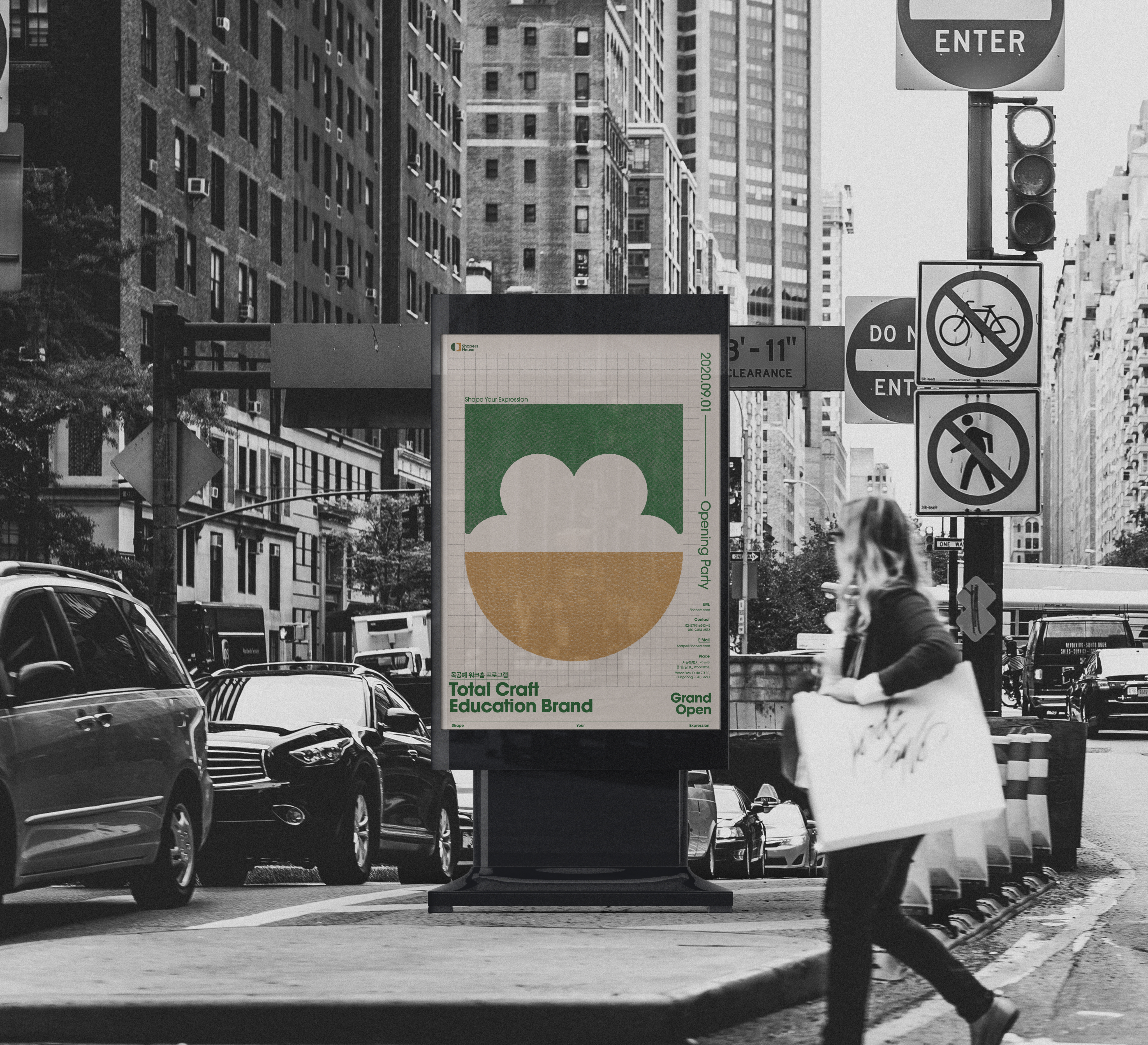
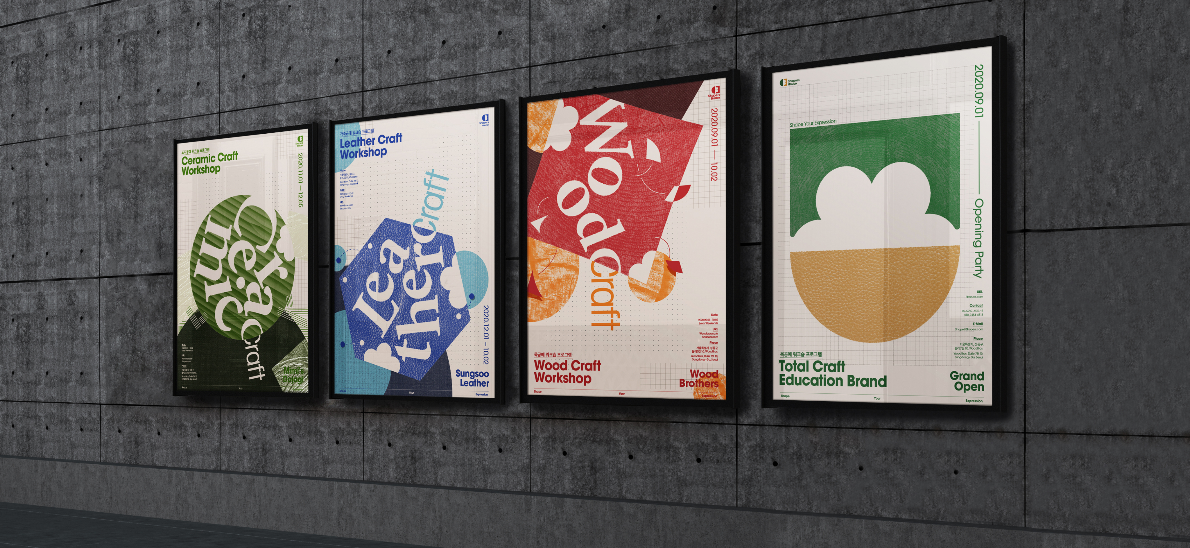
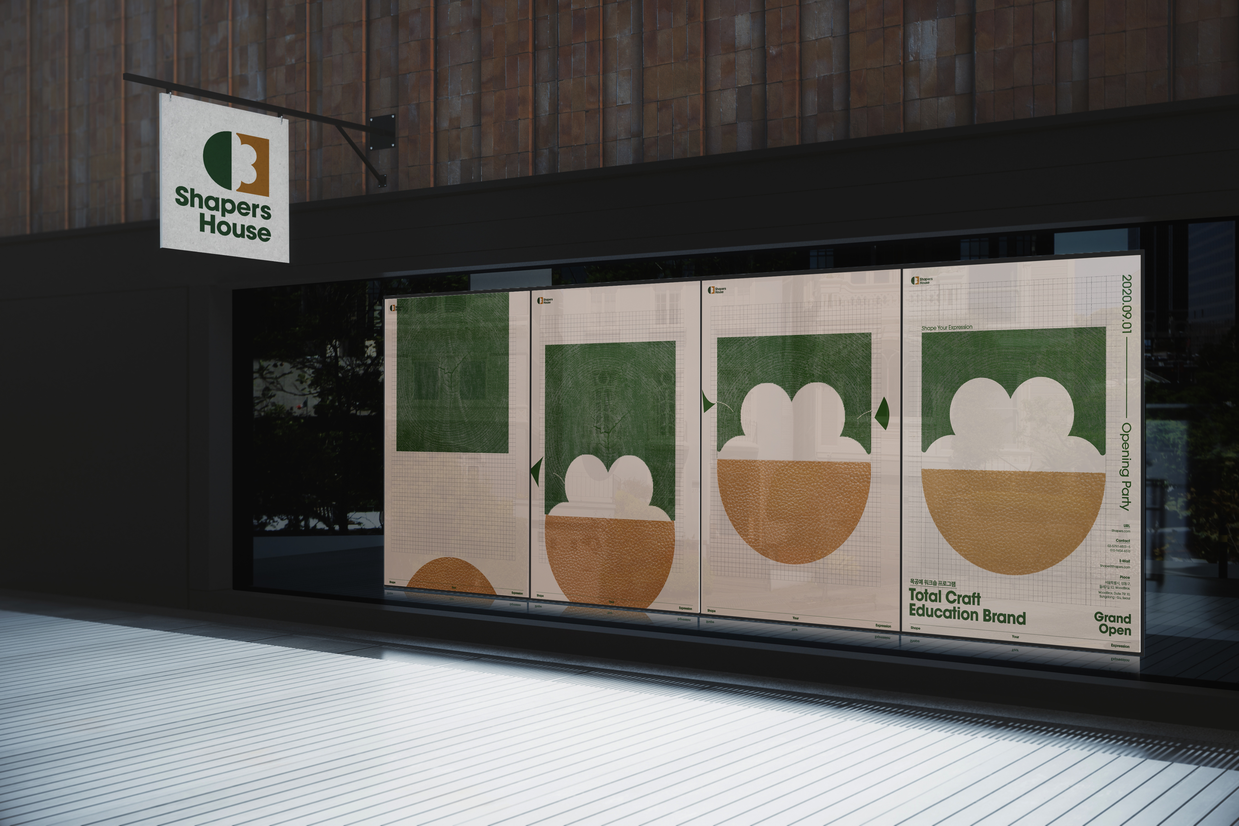
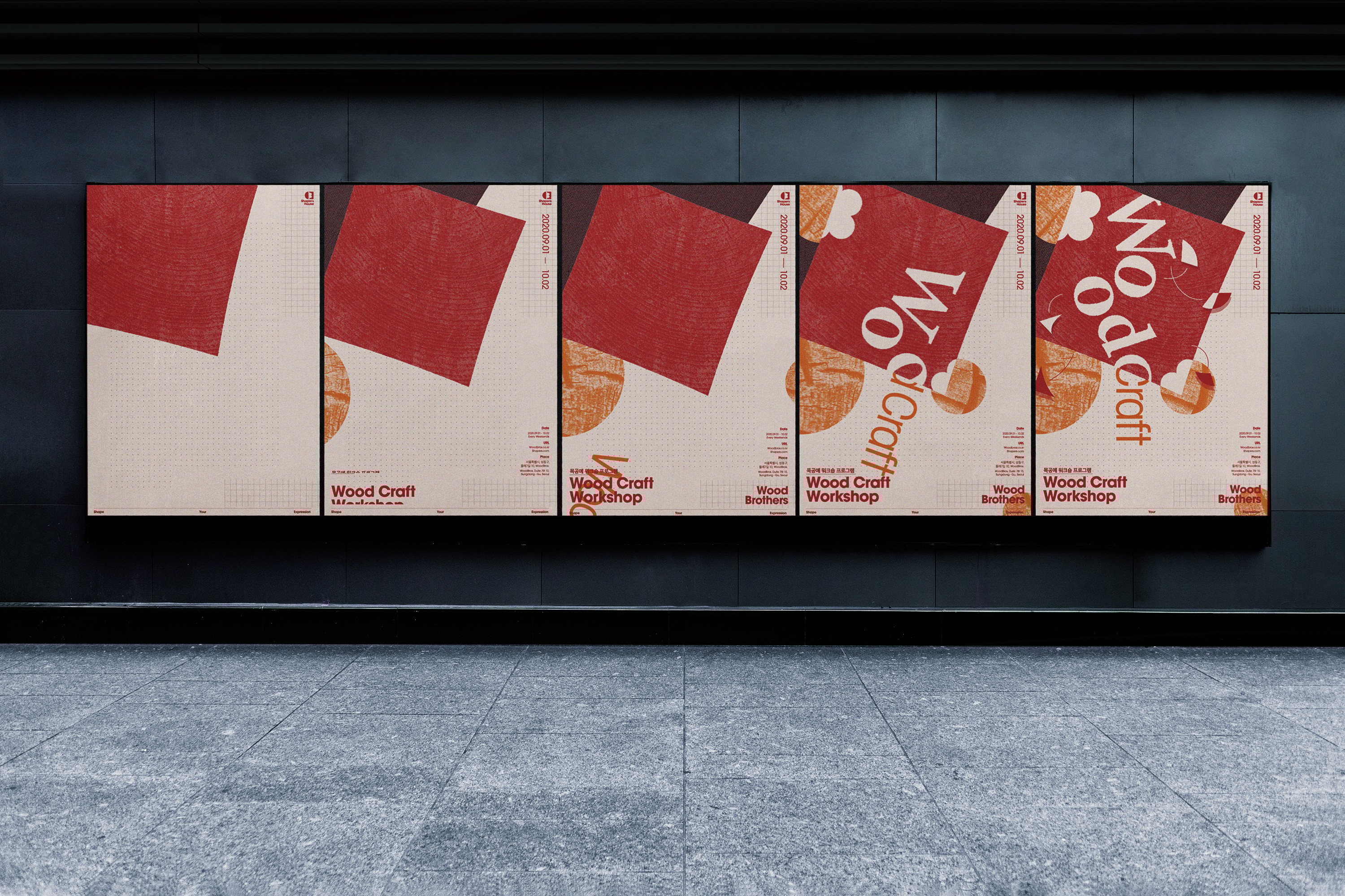
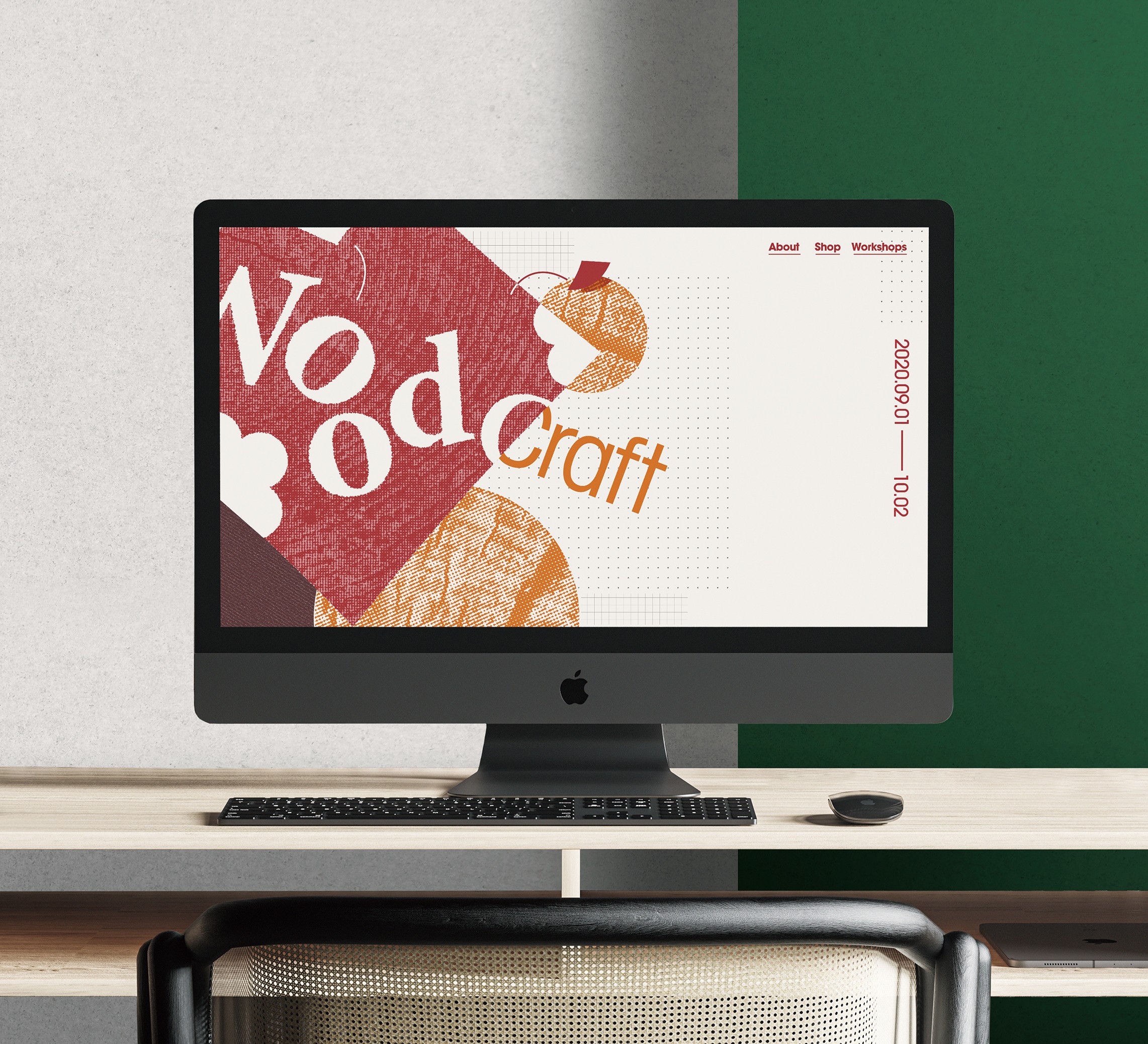
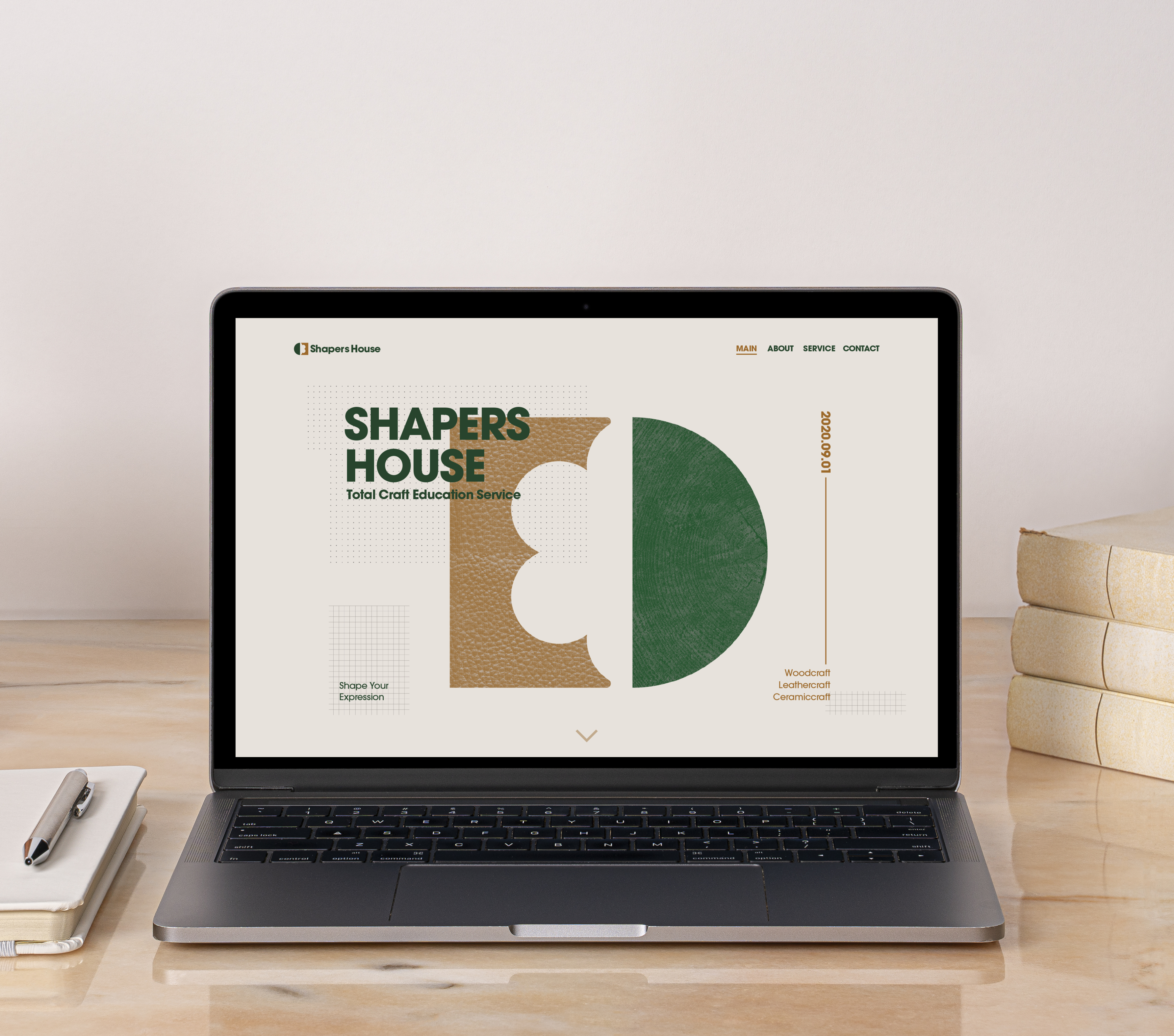
<쉐이퍼스 하우스>는 다양한 공예 분야의 공방들을 하나의 브랜드로 모아 일반인들에게 교육 및 체험 서비스를 제공하는 가상의 통합형 예술공방 브랜드입니다.
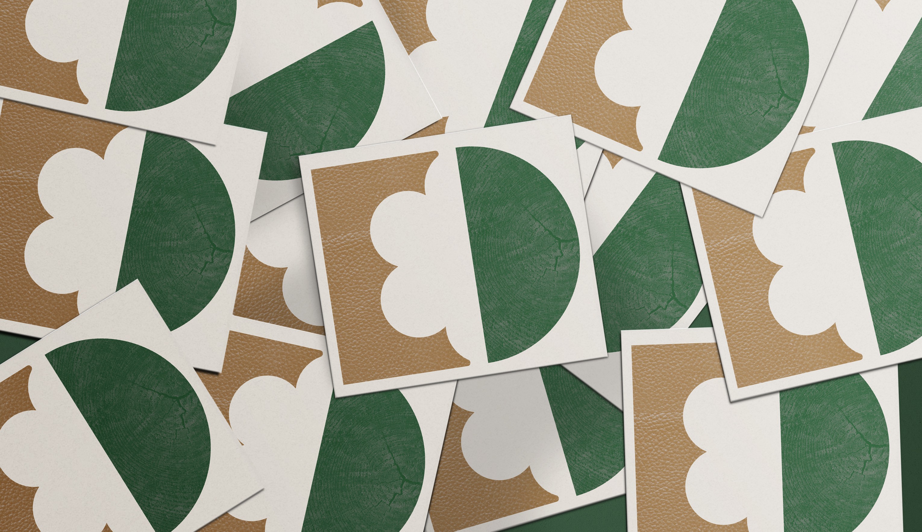
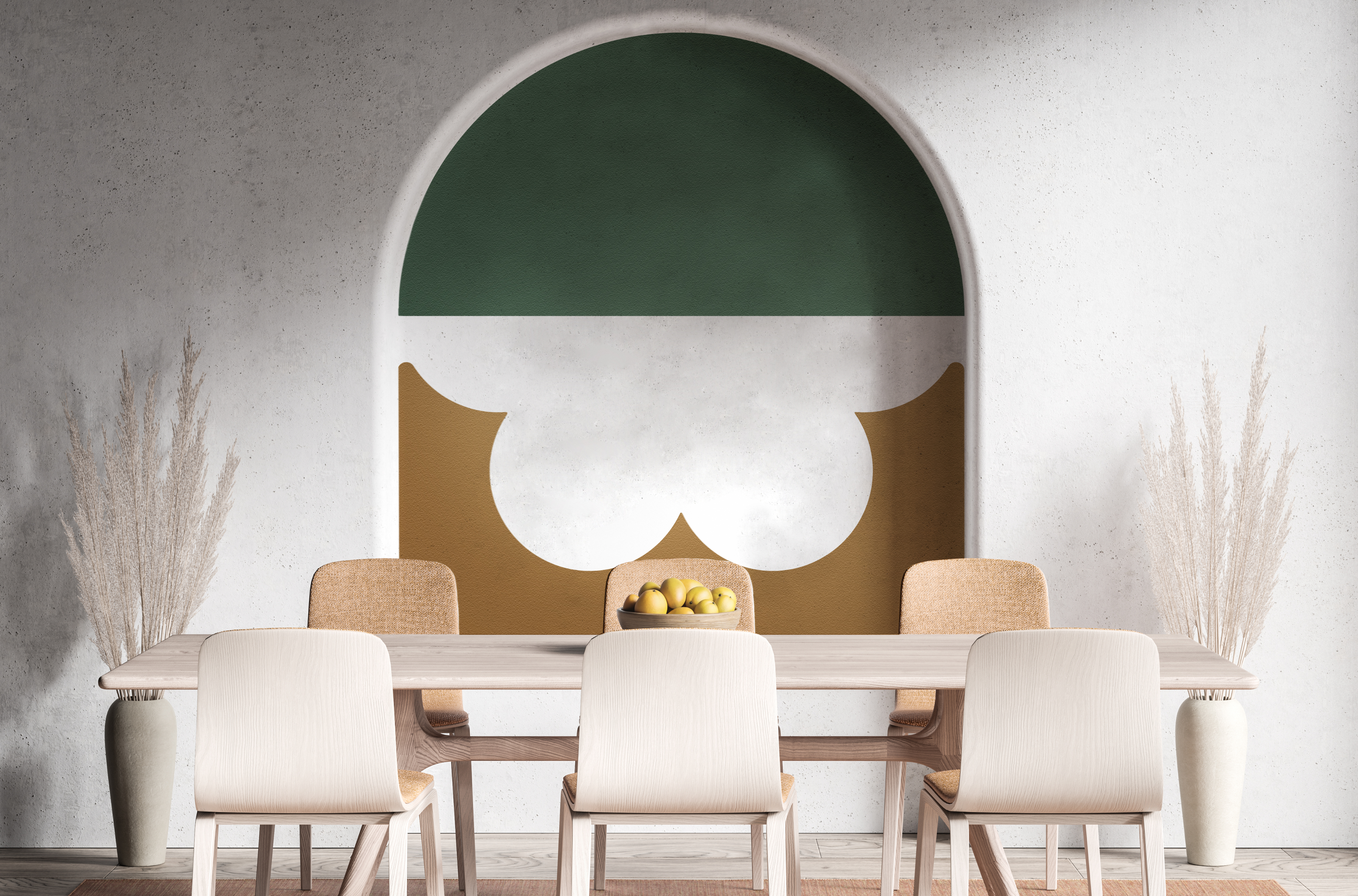
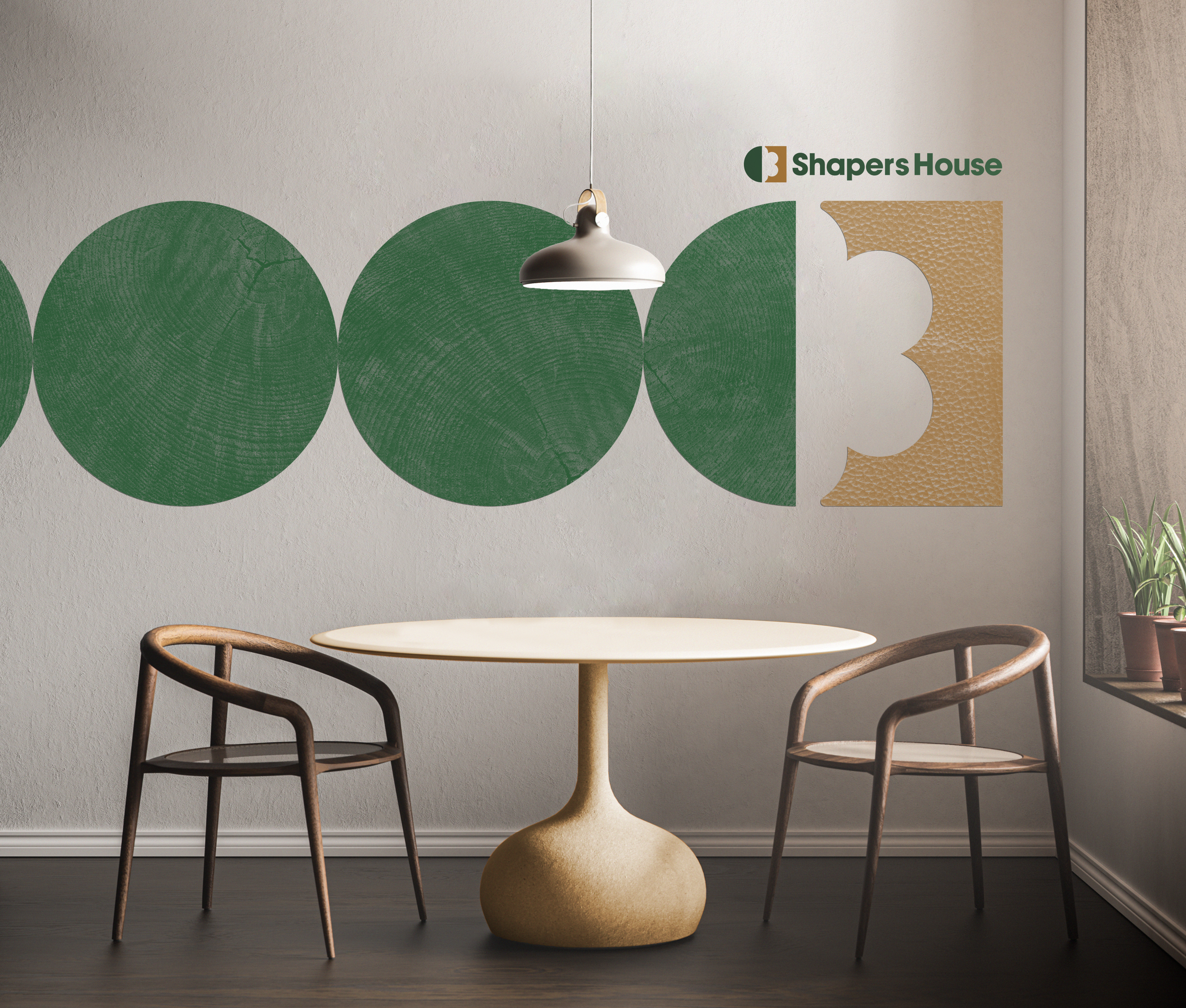
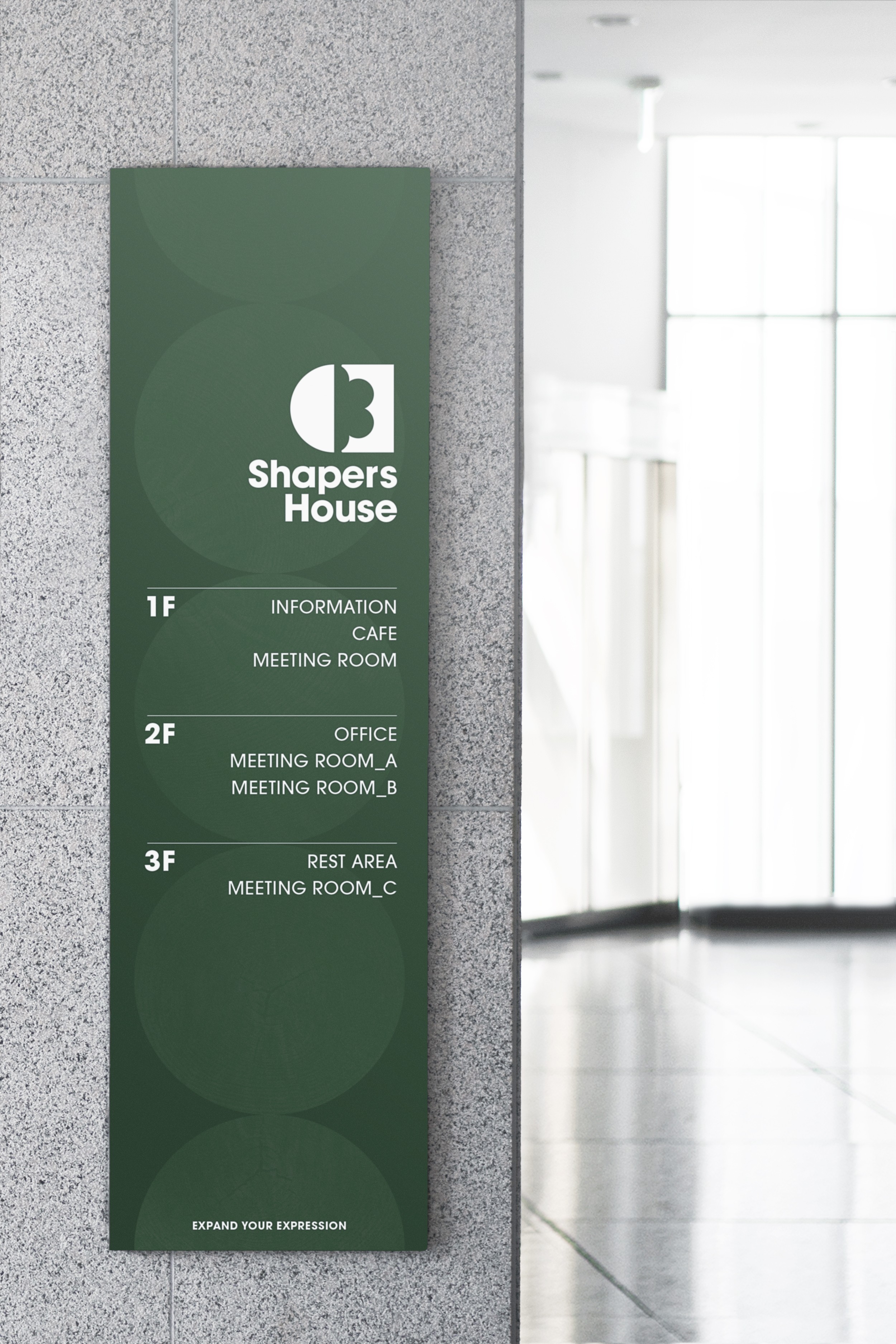
‘소비자’와 ‘공방’이 서로 만나 새로운 가치를 창조한다는 서비스의 핵심 비전을 브랜드 심볼과 그래픽에 비유적으로 담아내었으며, 공예 활동의 자연적이고 인간적인 그린과 베이지 컬러를 활용하여 자연적이며 사람의 손으로 만들어내는 공예의 특징을 표현하였습니다.
<Shapers House> is a conceptual integrated craft studio brand that brings together diverse workshops under a unified identity, offering educational and experiential programs to the public.
The brand’s core vision—creating new value through the connection between consumers and artisans—is metaphorically embodied in the logo and graphic system.
To reflect the organic and human-centered qualities of craft, the visual language employs green and beige tones that evoke a natural, handmade sensibility.
Brand Identity
Personal Project

WHERE AM I
13, 31gil, Gaeporo, Gangnam-Gu, Seoul, Korea
CONTACT
+82 10 9454 6513
ms.kim@dol3.com
SOCIAL
Behance

Brand Identity Design
Shapers House
<쉐이퍼스 하우스>는 다양한 공예 분야의 공방들을 하나의 브랜드로 모아 일반인들에게 교육 및 체험 서비스를 제공하는 가상의 통합형 예술공방 브랜드입니다.
‘소비자’와 ‘공방’이 서로 만나 새로운 가치를 창조한다는 서비스의 핵심 비전을 브랜드 심볼과 그래픽에 비유적으로 담아내었으며, 공예 활동의 자연적이고 인간적인 그린과 베이지 컬러를 활용하여 자연적이며 사람의 손으로 만들어내는 공예의 특징을 표현하였습니다.
<Shapers House> is a conceptual integrated craft studio brand that brings together diverse workshops under a unified identity, offering educational and experiential programs to the public.
The brand’s core vision—creating new value through the connection between consumers and artisans—is metaphorically embodied in the logo and graphic system.
To reflect the organic and human-centered qualities of craft, the visual language employs green and beige tones that evoke a natural, handmade sensibility.
Brand Identity
Personal Project

WHERE AM I
13, 31gil, Gaeporo, Gangnam-Gu, Seoul, Korea
CONTACT
+82 10 9454 6513
ms.kim@dol3.com
SOCIAL
Behance